According to HCL, Notes will get a new icon with the release of version 12. One that complements the new icon set introduced in 2019.
Why is this a big deal?
The blue Notes logo has been around for years. We’re familiar with it. It’s easy on our eyes and we are quickly able differentiate the Notes icon among many others. Even on desktops crammed with icons. We are used to it and it jumps out at us – a user experience advantage that can easily be underestimated. Especially today when you expect (from yourself) that every click is fast and precise.
Some of you may remember the many comments about past changes to Microsoft’s Office, Google’s Workspace, or Adobe’s Creative Cloud icons. Changes, which were not liked by everybody. Being accustomed to the look of the existing icons, users had difficulty associating the new icons with the corresponding programs and finding them quickly on the desktop or in the taskbar. In the worst case, this leads to user dissatisfaction and can even have a negative impact on motivation and productivity.
What happened during the last big icon change?
In 2013, when IBM released Notes 9, we were not surprised to learn that by far the single biggest upgrade issue for end users was the change of the Notes client shortcut:
A small change from orange to blue, as well as a slight modernization, led to a significant amount of helpdesk tickets: Many, many end users called and asked where they could now find the Notes client. They were asking how to launch Notes and if they can have a shortcut again.
A new symbol means change, and change takes time to get used to
The new set of HCL icons were introduced in 2019 and the community immediately liked the fresh design, the different colors, and unique textures. Most actually could not wait to see them on their devices.
So much for the theory. In practice, things are different. The change is made during the upgrade and suddenly they are there – the new icons of the applications. And then come the questions – which icon belongs to which program again?
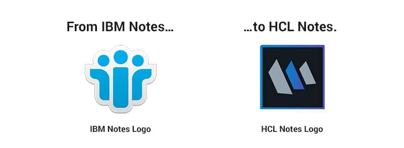
With the upcoming Notes 12 release, end users are up for the next change of the Notes client shortcut:
We love it! Although we would have also liked to see the new client icon to be more in line with the Notes Nomad icon. Perhaps only because of the N we see in it, and because to us Notes, Notes Nomad mobile and Notes Nomad web are all Notes clients.
How to avoid support tickets about missing icons
To make this transition a little easier for our customers and partners, we want to help end users find Notes after the update.
That’s why we recently added a new feature to MarvelClient Upgrade: Once the client has been upgraded successfully, MarvelClient Upgrade shows each user a preview of their very own Windows desktop, and where they can find the Notes client.
And click – the switch is flipped, the connection is there. You see an icon and immediately associate the new logo with the Notes you were looking for.
At this point, you’ve made the transition. You feel like an expert again, as if things had never changed.
Happy Upgrading!
What’s Next?
Unboxing HCL Notes/Domino v12
Harder Better Faster Stronger?
Few things in life are as exciting as getting a new piece of technology to play with, wouldn’t you agree? Taking it apart, inspecting the pieces, learning how it all works… and hopefully putting it back together again!
Be ahead of the curve and join HCL Ambassadors Chris Adler & Marc Thomas in this open-mic style meeting taking place directly after the release.