![]()
Page History
...
Pie charts, bar charts, line graphs and bubble charts that show you multiple categories often allow you to select/deselect certain categories to focus in on subset. To do so, simply click on the category in the charts legend.


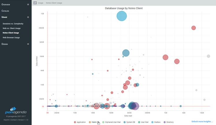
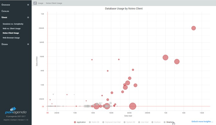
Certain Bubble charts allow you to focus in on part of the graph by using the mouse to select the top left most grid point of the area you would like to focus in on, holding the right left mouse button down and drawing it to the bottom right grid point you would like to focus in on. Releasing the mouse there. This will concentrate the graph in on the selected area.
...
Hide left menu: To maximize screen width on a graph or page it is possible to hide the left- hand menu of panagenda ApplicationInsights. To do so click the so called 'hamburger' icon in the top right corner.


To return the menu simply click the same icon again.
...
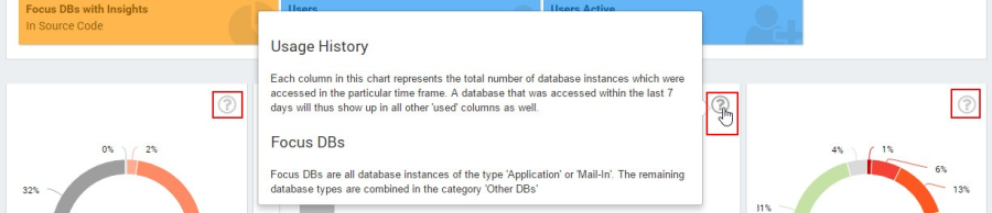
"?" Symbol in right corner next to graphs: Indicates that there is a help text available that will be visible on mouse over.

Details: Some graphs will allow you to mouse over or click on a node or data point to access more data. To go to the instance details page for any given database in any of the bubble charts for instance, simply double click on the bubble.
Next Topic: