Page History
Dashboards enable you to customize GreenLight infrastructure monitoring to suit your individual use cases. We recommend to prepare the information in Grids before you create Dashboards.
| Info |
|---|
| Please note that this page is empty before you have configured your first dashboard. |
Contents:
| Table of Contents |
|---|
Create New Dashboard
After clicking this button, a popup will appear where you can set the name of your dashboard and whether it should be available for all users (= public enabled) or only for you.
There are several kinds of gadgets you can add to your dashboad:
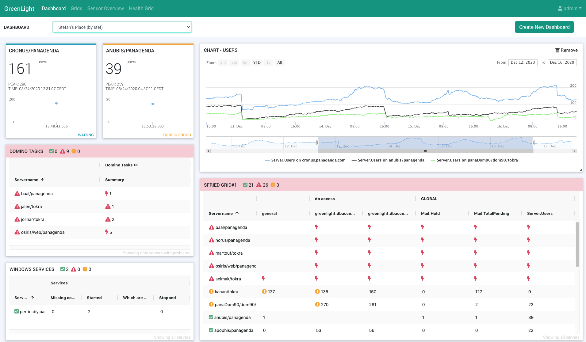
GRID
When choosing this option (from the Add gadget button) you will see a drop down list of your preconfigured Grids. Select the one you wish to see on your dashboard and hit the Add button.
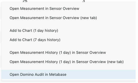
Based on these grids, you can create ad-hoc charts or you can create a chart and add it to the dashboard permanently. To do right click on a measurement in the grid and select Add to Chart... from the context menu. An ad-hoc chart will be created which can be added to the dashboard by clicking on the green + icon next to "MEASUREMENT HISTORY" in the popup header bar:

You will be asked to name the chart, then click on save.
NOTIFICATIONS BAR
This selection adds a notification bar, which you may already know form the Health Grid, to your dashboard.
DOMINO SERVER CARD
asdf
- Qick overview for domino server
- select server (preview) - prerequisites (sensors): Domino Statistics/Domino Availability/Domino DB Access (CONFIG ERROR, if one is missing) - save
ADD Charts:
- On-demand chart from grid
- Plus Icon to add it to dashboard
Charts von Dashboard: Nur letzte 7 Tage (Metabase)
Adjust size, location (video https://www.panagenda.com/kbase/display/gl/How+to+build+a+Dashboard+-+example+1)
Save Icon!
Default (for user) --> Star Icon (statt health grid)
Cogwheel (Name, public)
- Check Context Menu Options