If you click the "<< Charts >>" entry in the left-hand navigator:

a new tab will open in your Notes client that displays summary information about several different types of data in the SecurityInsider database.
These charts give you summary information about some of the data in the SecurityInsider database, that can be a useful overview of the data in general. If you click on any of the charts, you will be brought to the Notes view that provides data for the chart, in case you want to look at the data in more detail.
The charts include:
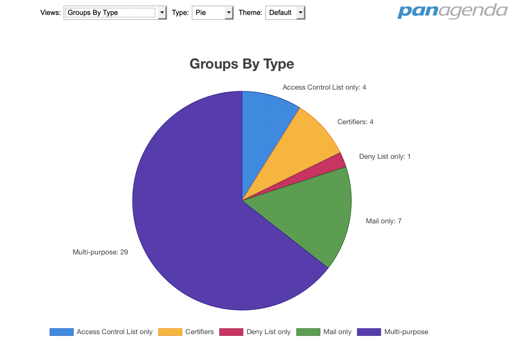
Groups By Type
This chart shows how many groups of each type were found in your Domino directory. The types are: multi-purpose, mail-only, security-only, deny list only, and certifiers. Ideally you have a large percentage of groups that are either mail-only or security-only, because that prevents a situation where you add a user to a mixed group (thinking it's only for mail) and accidentally give that user access to a database (because it's also used for ACL access).
Groups By Size
This chart breaks the groups down by size, giving percentages of how many groups are empty, or have less than 10, less than 100, less than 1000, or greater than 1000 members.
Empty groups are groups you might want to remove. Very large groups could be an indication that a group has more members than it should have, due to deep nesting of subgroups. This could cause ACL problems (too much access) or mail problems (too many recipients).
Explicit Group Members
This chart shows the combined user statistics of all the groups in your directory. Not only does it show you how many groups are empty or have unknown members, but it also shows how the group membership breaks down into subgroups, users, and servers.
Normally you would want to take a look at empty groups and groups with unknown members, because those are candidates for cleanup or removal. If this chart shows a large percentage of subgroups, that could be a problem too, because deep nesting of subgroups can make it easier to give people accidental access to databases.
Explicit Database Members
This chart shows the combined ACL membership of all the databases on your servers. In other words, it shows what percentage of the ACLs are made up of individual users, groups, or servers. It also includes separate entries for Default, Anonymous, and No Access users.
In most environments, groups have the highest percentage of your ACL membership, because database access is managed via the directory instead of by directly modifying the ACL. Servers will also tend to have a high percentage, because most databases have at least one server directly named in the ACL.
Unless you like to manage your ACLs directly, a high percentage of users that are directly named in your ACLs could be a warning sign.
Default Database Access
This chart shows the breakdown of how many databases have the "Default" user listed as having no access, reader access, author access, etc.
An obvious danger sign here is if there are any databases that give Designer or Manager access to the default user.
Change Backups
If you are keeping change backups, this chart will tell you how many Group, Database, or Endpoint documents have been changed each month for the past 4 months.
Change backups can be turned on or off in the Configuration document of SecurityInsider. If they are turned on, then every time a document in this database changes, a full copy of the previous version of the document will be saved as a change backup, including information about what changed.
Change backups are valuable because they allow you to see when database access or group access changes, and they also allow you to see who had access in a specific database or group at some point in the past.