Let management dashboards replace your progress reporting
Progress reporting. They’re a part of every project and they’re not fun to produce. It’s not just your progress you must share. You must also supply the project teams with the data they need to do their job. It’s tough to coordinate and it never ends.
Let Analytics API’s empower your teams with self-service access to the data they need. A one-off set-up frees you from the drudgery of manual reporting and ensures your colleagues have continuous access to status reports that are always up to date.
Get back to the work you really need to focus on.
Business intelligence and data exploration tools can make your life easier
We hear the same thing over and over from project managers: “Creating progress reports is an endless chore, takes a lot time and is usually required at the worst times imaginable!”.
There is an easier way.
Using business intelligence and data exploration tools, you can gather, compile and make information available in dashboards tailored to the specific needs of various consumer groups.
Your entire organization will benefit from this self-service approach. The reports you create using this solution be:
- less time consuming and cheaper to produce,
- automatically always up to date, and
- available on demand.
You can present this information in a number of useful and interesting ways. You can use dashboards, charts, and even a new breed of interactive reports.
To create your reports, you could choose from a number of purpose-built tools readily available in the market. In practice, you will use something that’s already available within your organization. If you are lucky, it will be one of the solutions mentioned in the “Gartner 2020 Magic Quadrant for Analytics and Business Intelligence Platforms”.
3 ways to produce reports using 4 common tools
Without needing a corporate purchase decision, you probably already have access to some combination of the software below. If so, read on!
Solution 1 – Microsoft Excel & PowerPoint
Admittedly, this combination is by no stretch of the imagination a BI or dashboarding tool. However, it’s fair to say that with its Pivot tables, charts and data source capabilities, Excel has a lot to offer when it comes to data analysis and exploration. Combine that with the presentation capabilities of PowerPoint, and you might be surprised how close you get to automated reports.
This combination offers two major advantages:
- It is readily available in most organizations, and
- there are usually a number of people with a high level of expertise.
Data Source
In this example, we use an Excel file exported from iDNA Applications. However, the techniques we show will work for all kinds of other sources as well. Working with Excel sheets that are not connected to the original data source makes it significantly harder to keep the reports updated. Still, we’ll use this example to showcase the simplest variant.
N.B. – Recent versions of Excel and Power BI have a significant overlap in their feature sets and usability when it comes to importing data from external sources. If you would like to link your spread sheets to live data, please follow the instructions in the Power BI chapter before you continue to the next chapter.
Data Exploration
The content of our data set is a list of Domino database instances. Each has a variety of properties like title, server, file name and database type. Our goal is to find out how many of them are applications and how many are mail-in databases. We are looking to display the data using a visualization that will show the relative size between the two categories.
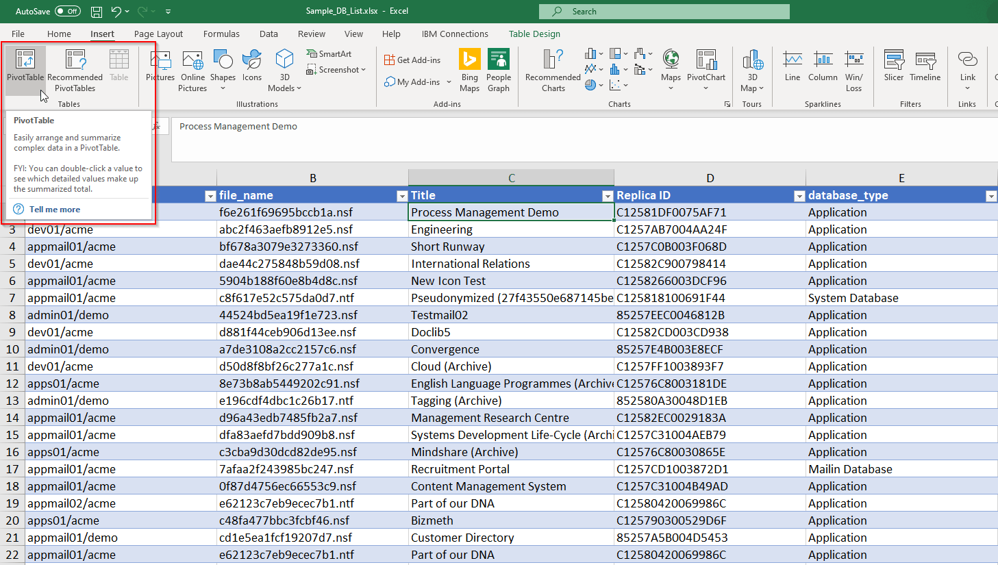
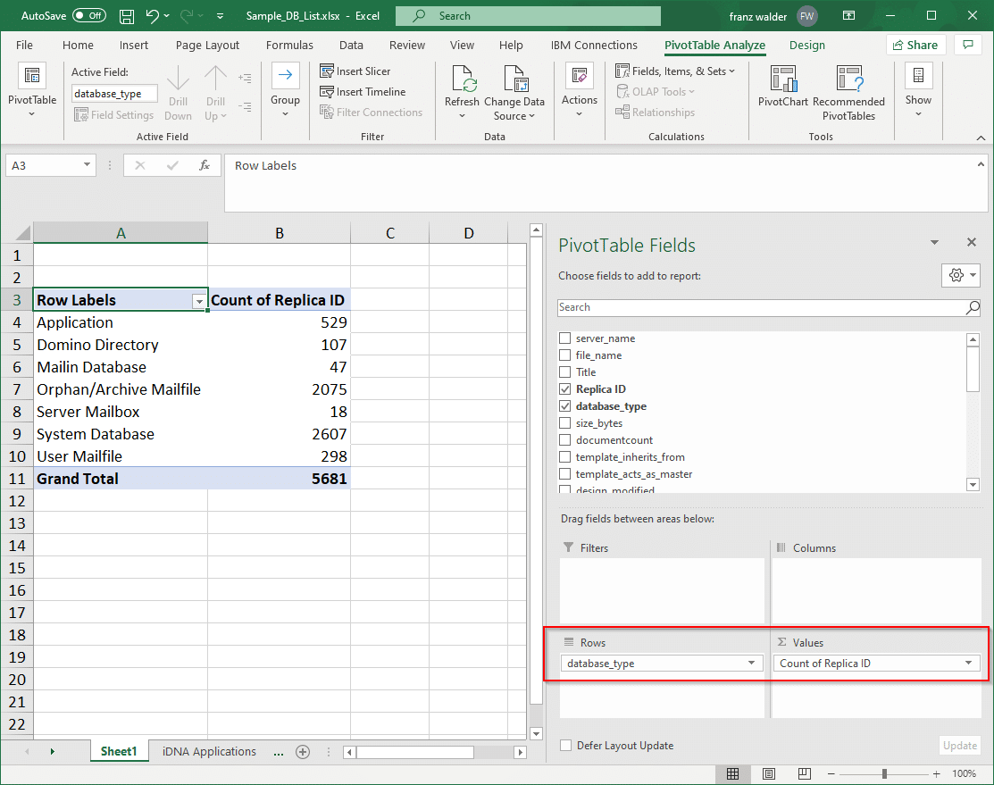
The first thing we do is insert a Pivot Table (PT) based on the data. To do that, we select a cell in the table and click “Pivot Table” on the “Insert” ribbon.
In the PT Fields configuration interface, we drag “database_type” to Rows to create our categories and “Replica ID” to Values to count it. The “Count of” operation is selected by default. That will show us the number of DBs per category.
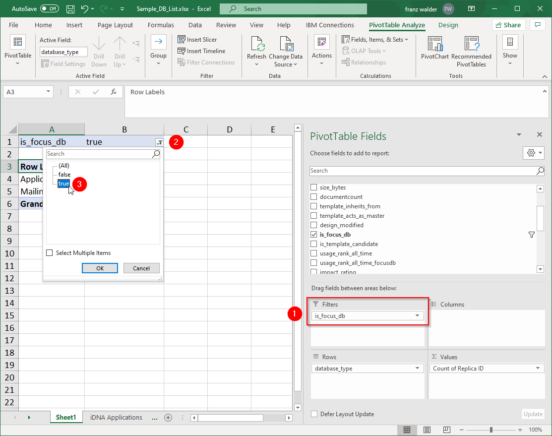
Since we are only interested in Focus Databases, we drag the “is_focus_db” field to the Filters box and then select “true” in the filters dialog above our results table. That will give us the results just for the database types we are interested in.
Data Visualization
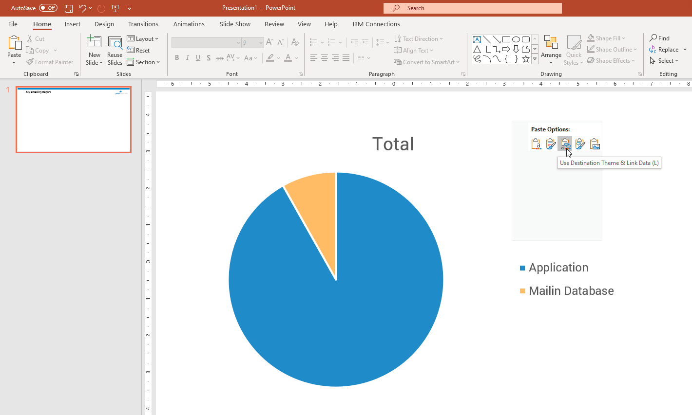
Now, we have the data points we want. Next, let’s create our first visualization. Select a cell of the Pivot Table and then click on the pie chart symbol on the Insert ribbon. There we have the chart we were looking for: a representation of how many Focus DBs are Applications and how many are mail-in databases. Now, right-click the chart and select Copy to get this in the clipboard.
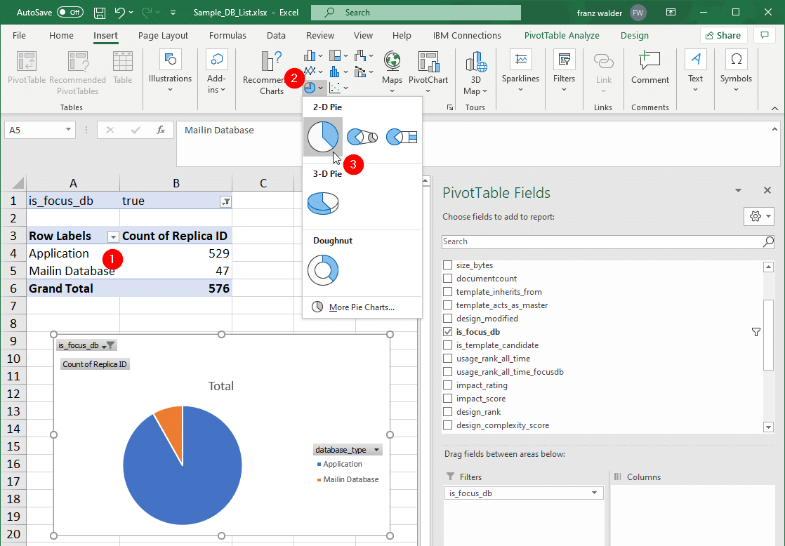
In the next step we’ll need to open PowerPoint as we are using it to compile our report. Here we paste our chart by right-clicking anywhere on the canvas and selecting an option with “Link Data”. Whether you use the destination or source theme is up to you.
N.B. – Linking is very important here, because embedding will break the connection between the Excel sheet and the PowerPoint presentation. This disconnect might be desirable in some situations, but it won’t provide the functionality we need.
The chart is now a PowerPoint object you can freely style and format according to your taste, needs or corporate design.
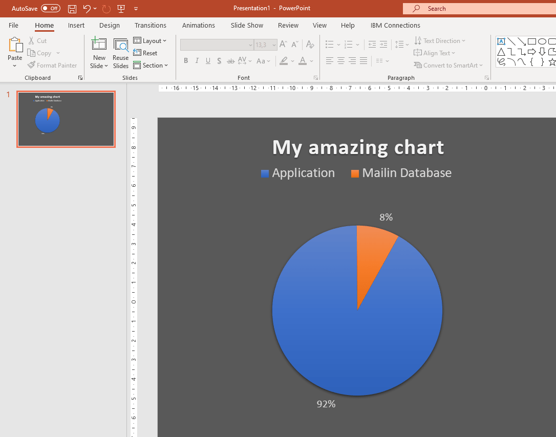
The most important thing about this combination though, is that data changes in the Excel sheet will influence the visualization in PowerPoint. If you now want to create a monthly report, for example, all you need to do is update the excel sheet with the correct database list. The pivot chart will reflect those changes and so will the chart in PowerPoint (a manual refresh might be required). If you created a dozen charts and tables based on the Excel sheet, all of them will update with the data changes. That’s why this solution is so powerful.

The question then becomes how you share your report. We have seen customers create PDF files from the PowerPoint presentation and share them in HCL Connections or SharePoint. Of course it’s an option to simply send the file per email, but that would put you in the situation again where you have to “deliver” the reports to someone instead of putting them in a central location where your stakeholders can go and get the information from.
Solution 2 – Microsoft Power BI
With Power BI we have a great tool in hand for the job we’re trying to accomplish. Its capabilities around data analysis and exploration, as well as dashboarding, are top notch. They are leaders in Gartner’s Magic quadrant on Analysis for a reason.
Microsoft managed to strike a beautiful balance between powerful functionality and ease of use. A lot of its data source integration and data manipulation features are very similar to Excel. This makes for an exceptionally smooth learning curve.
“Power BI Desktop” is free of charge. There aren’t a lot of limitations compared to the Pro version. However, you cannot share your content with co-workers unless you share the whole Power BI file. Even when using the pro version, information consumers need a Power BI license unless your dashboards are publicly available on the internet. For many organizations, that is not an option. Still, it’s still a great solution for our needs, even though we have to share the result as if it was just another Office document.
Data Source
We’ll gather our data from panagenda iDNA Applications again. This time around though, we’ll create a live connection to the data using DataMiner, iDNAs analytics API. Our whole dashboard will update automatically if data changes in the backend. The same method can be used in Excel, since the data source features are very similar.
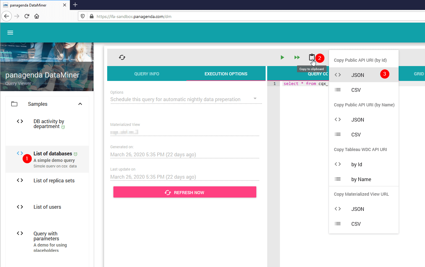
In DataMiner, select the query you want to link to and click the clipboard icon to copy the URL to the query result in JSON format. Both Power BI and Excel can work with it natively and you don’t have to worry about delimiters in DB titles, like you would have to with CSV.
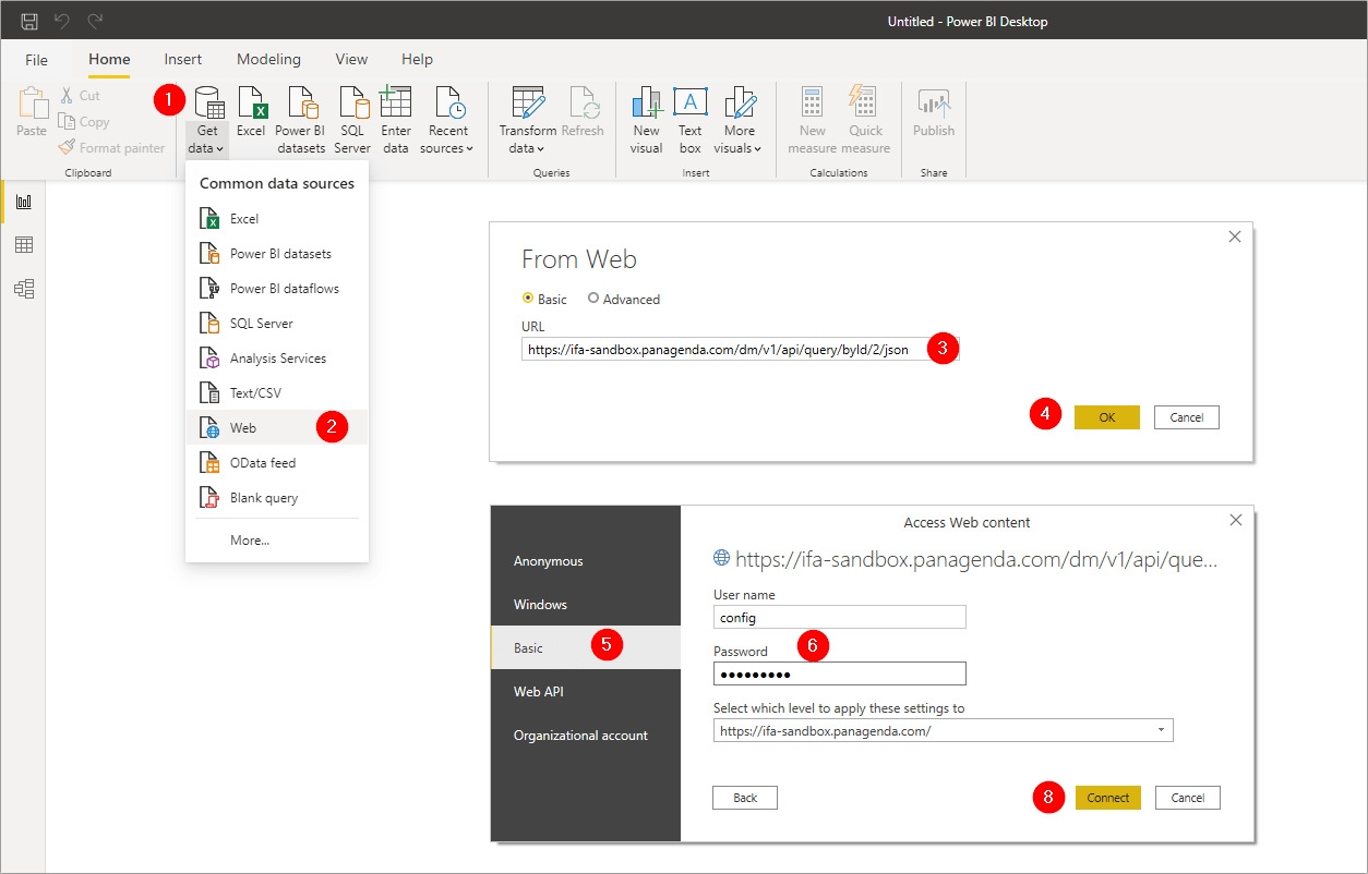
Back in Power BI click “Get data” in the Home ribbon and select “Web” as the source. You will be prompted to enter a URL next and we can simply paste the one we just copied in DataMiner. After selecting Basic authentication and entering credentials, we can finish connecting to the data source.
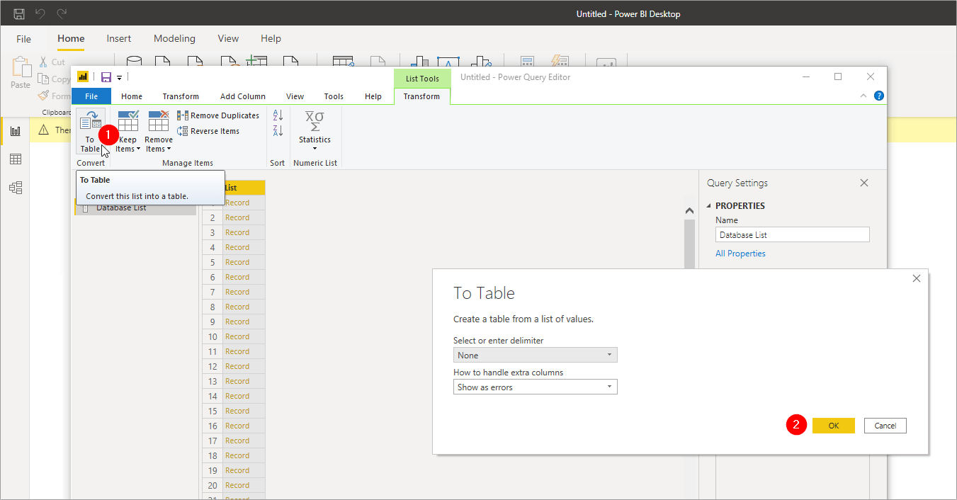
After the connection was established successfully, the Query Editor will open in a new window. The first thing we need to do is click the “To Table” button in the top left corner to convert the list of records into a table we can later work with. Just accept the default options in the pop-up window and click OK.
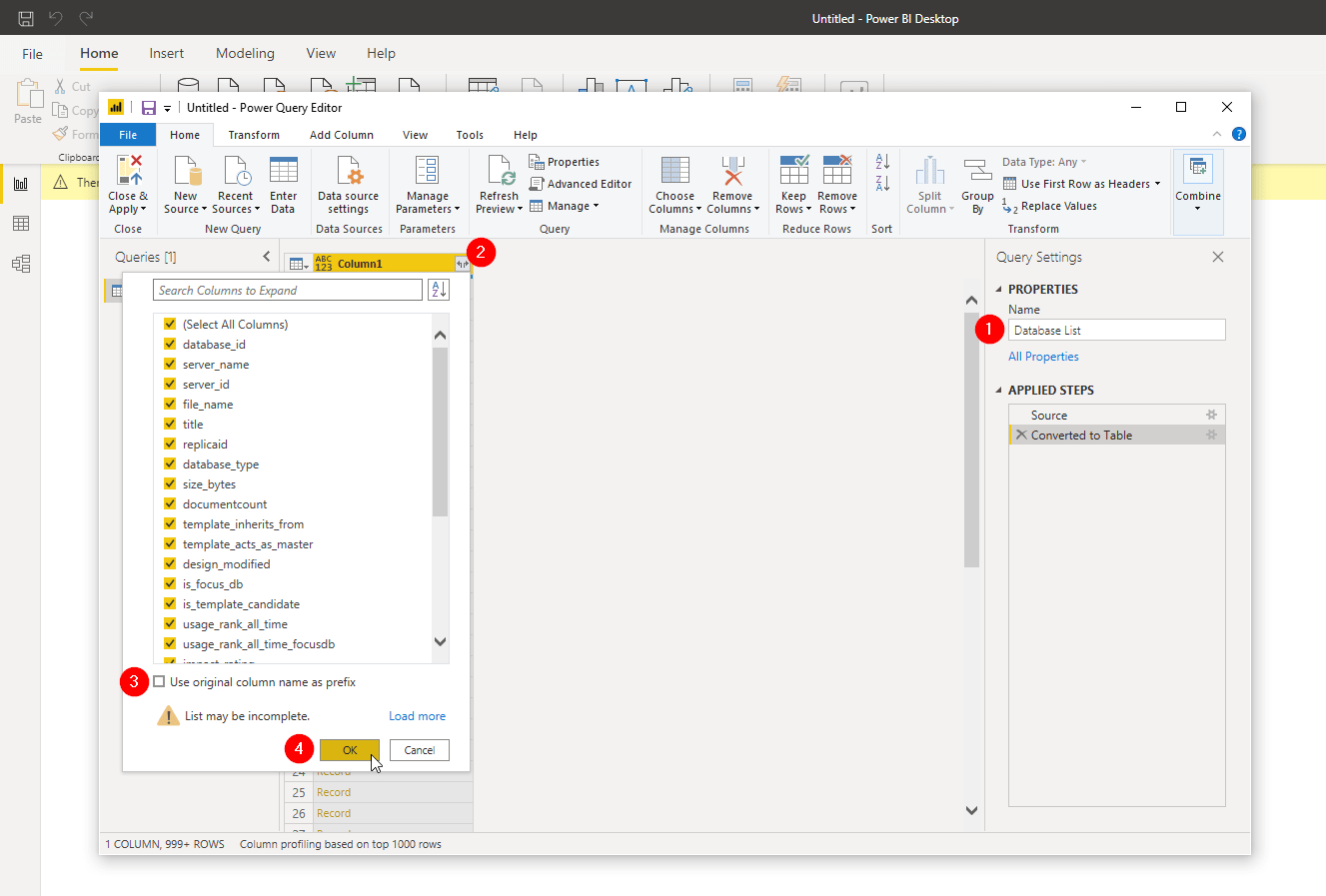
Now that we have a table, let’s give it a proper name, so we can identify it later, in case we have multiple sources. Then we click the small icon on the top-right of our first column that looks like to arrows pointing away from each other. With it we can expand the JSON record into individual columns. I recommend unchecking the option “Use original column name as prefix”, as all our columns have unique names and we are not expanding more than one JSON field.
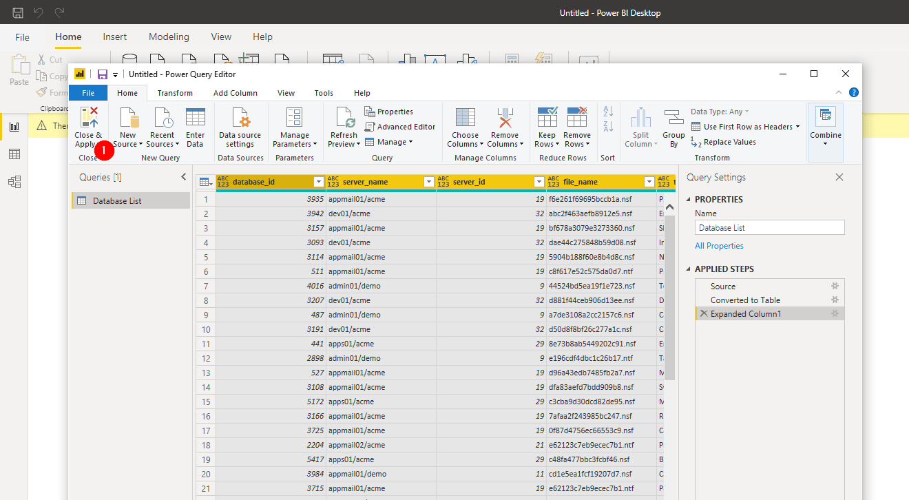
Once that is done, we’ll see our data in individual columns for the first time and could change data types or even manipulate data already. It’s not necessary in our case though, so we simply click “Close & Apply” in the top left corner.
Data Exploration and Visualization
Back in the dashboard view we click “Pie chart” on the Visualizations area. After selecting the new object, drag the field “database_type” from the Fields list on the right to the Legend box (2) to specify the categories for our chart. Within those categories we want to count items. We accomplish that by dragging the “replicaid” field to the Values box (3).
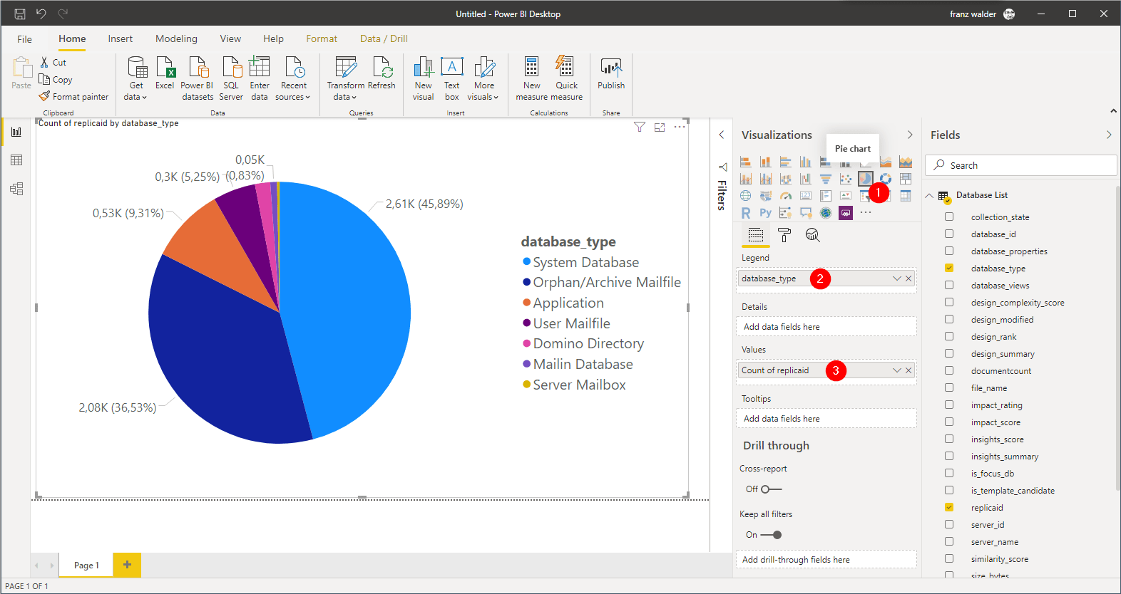
We have the same issue that we had in Excel though. We see all database types, but we only want to see Focus databases. To accomplish that, drag the “is_focus_db” field from the Fields list into the “Filter on this page” box in the filters area (might be minimized by default). After that is done, we now have the option to select which items we want to see and we select “true” to see only Focus DBs.
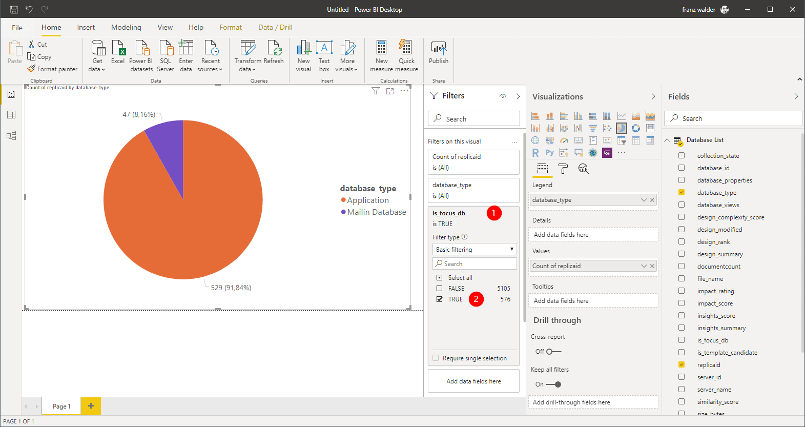
Voilà, there we have our pie chart again. We can see the ratio between applications and mail-in databases!
Of course, that’s an extremely simple example of Power BI’s capabilities. You can find more information in the webinar that accompanies this blog post. There we use an additional data set to bring user activity by department into the mix. Power BI allows linking the two data sets and exploring them together.
In this example, we used data from panagenda’s own solutions. Of course we could have connected to any compatible data source or even simply started from an Excel file. Regardless of the data source, Power BI makes it very easy to create dashboards and takes visualization and presentation to a new level. Users who open my dashboard will be able to explore not just my dashboard but the data behind it. They will be able to filter, format and drill down into what’s important for them. Even though the free version has its limitations and I have to file-share it like the PowerPoint presentation we created earlier, it’s an immense step up from “just” a couple of slides with static content.
Solution 3 – Metabase
Here we find a drastically different approach to accomplish something similar to what we did in Power BI.
Metabase is an open-source data exploration and analytics solution that “lets you ask your own questions”. It is completely web based and has multiple ways to share your questions and dashboards publicly or with individuals.
One of the key characteristics that we are looking for is the ability to run it on-prem. Even though a hosted Metabase offering is in the works and an Enterprise version is available, for our scenario we can use what the free on-prem edition has to offer.
Data Source
Metabase differs from Excel and Power BI by being deeply intertwined with the database system it sets out to analyze. When you ask your questions in the slick web interface, it creates SQL queries on the fly so the database server does the data crunching. That’s a great way of exploring data, especially since the tables and columns can be enriched with metadata at a central point.
Here’s an example how you can use this. You would create user friendly names for columns (like “DB Type” instead of “database_type_text”) or set up relations between tables. The end-user can easily benefit from SQL JOINs without having to know the data or even what a JOIN is!
There is a down-side to this though. Metabase cannot work with simple files like CSV or Excel as a data source unless you first import them into a relational database. That’s not a tough hurdle to cross, but it adds another layer of complexity. If a simple file is your only data source, Power BI might be the more convenient solution for you.
That said, we at panagenda have looked long and hard for a web-based solution like Metabase. Nothing we have found has come close to the wealth of features, simplicity and elegance that it offers as an open-source solution. Beyond that it has a very active community and a healthy developer participation. It is an amazing package!
N.B. – If you use iDNA Applications, Metabase comes pre-installed, configured and ready for you to use! If you don’t, a discussion on how to set up Metabase is beyond the scope of this blog. If you wish to know more, you can look here:
Data Exploration and Visualization
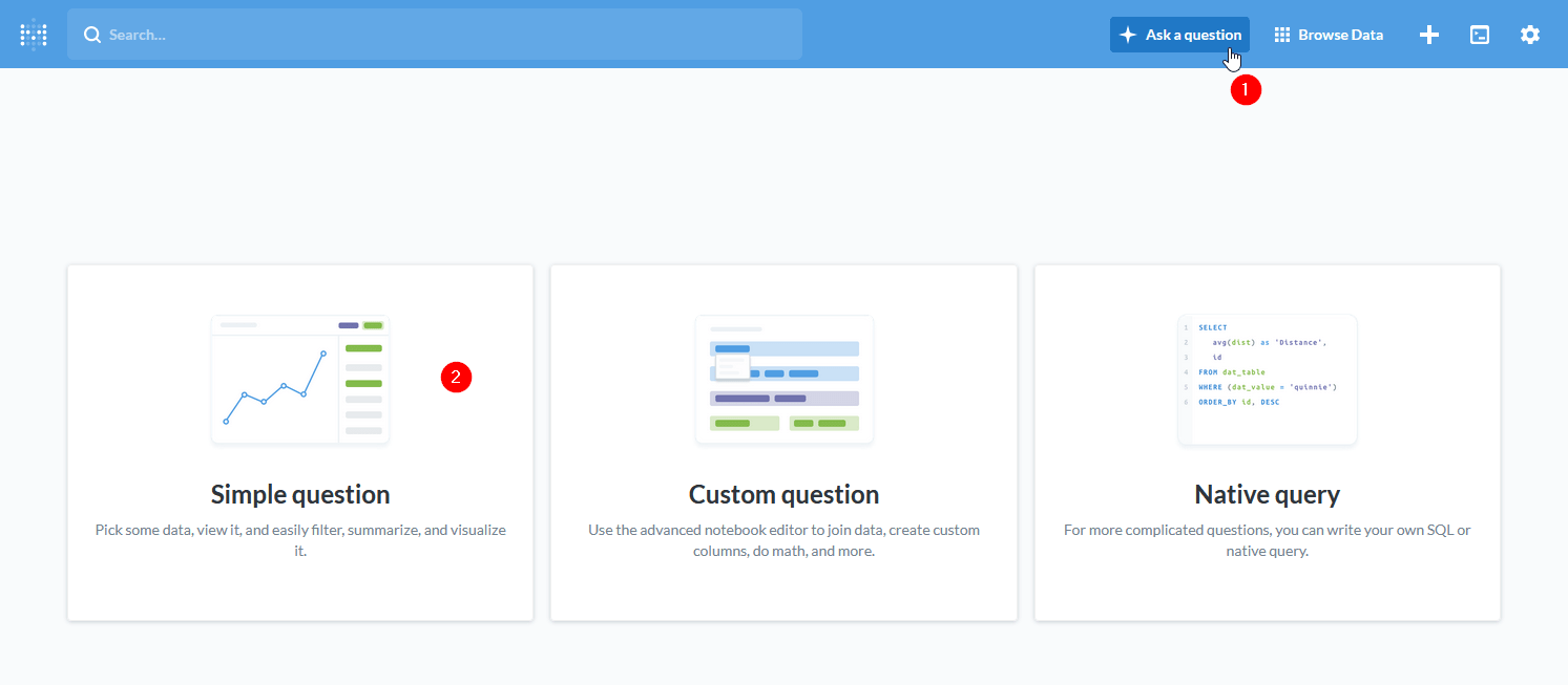
To start out in Metabase we can simply click the “Ask a question” button in the top menu bar. It will present us with three options:
- Simple question: an easy way to explore data with simple grouping, filtering and visualization functionality.
- Custom question: a notebook-like editor to join data, create custom columns and perform advanced operations like calculating custom columns.
- Native query: allows entering your own SQL queries for even more advanced operations like e.g. working with window functions.
We’ll just go ahead and select a simple question. We can convert it into a custom question later or view the SQL behind it if we need to.
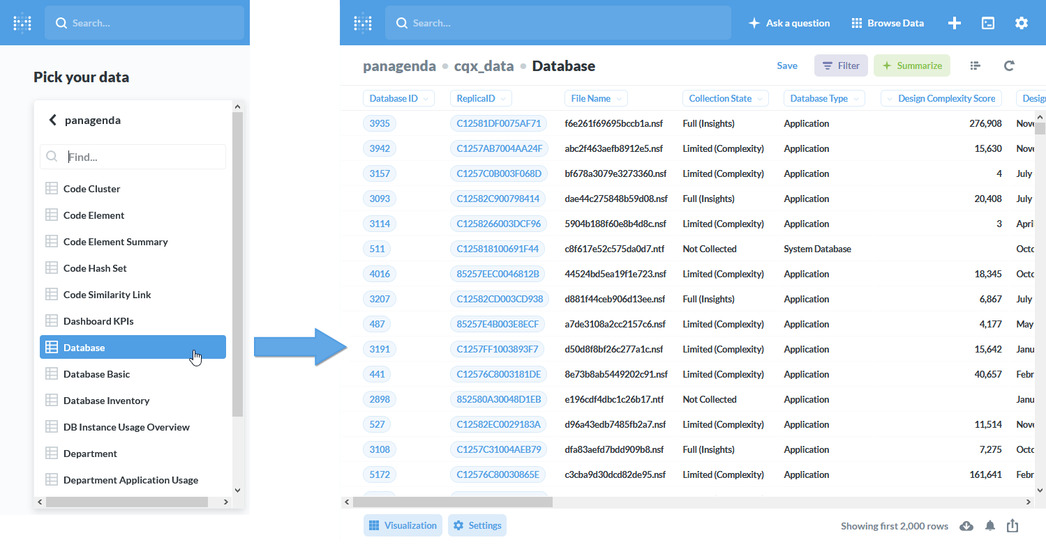
After selecting the “Database” table as our data source, Metabase shows us some of the content to get a feel for what the data looks like.
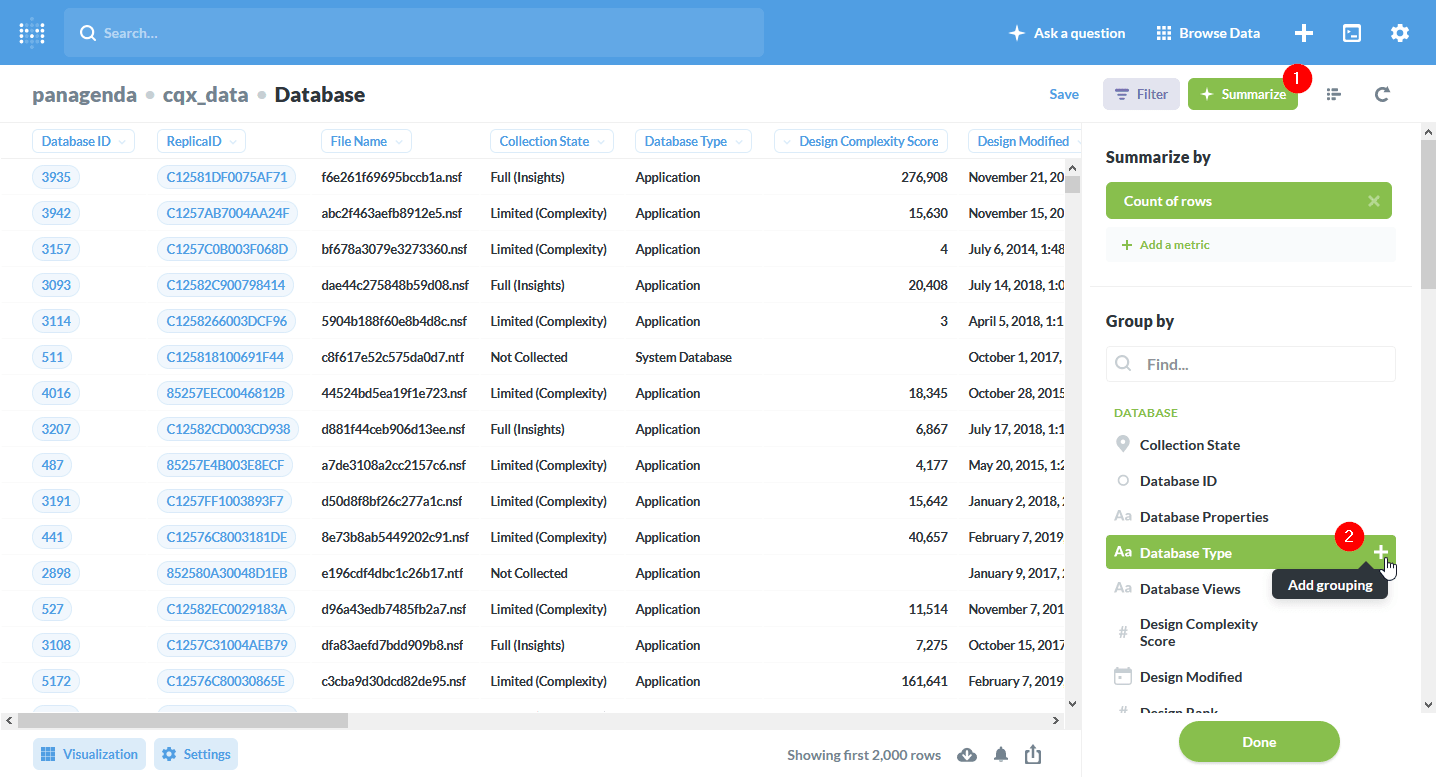
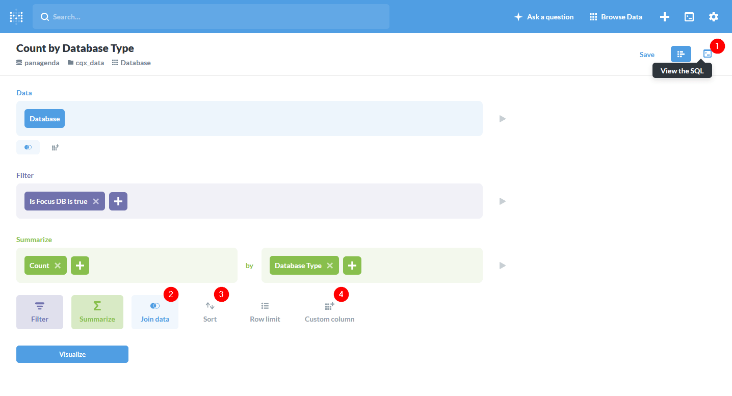
Here we select “Summarize” (1) and pick “Database Type” (2) as the field we want to group or summarize by.
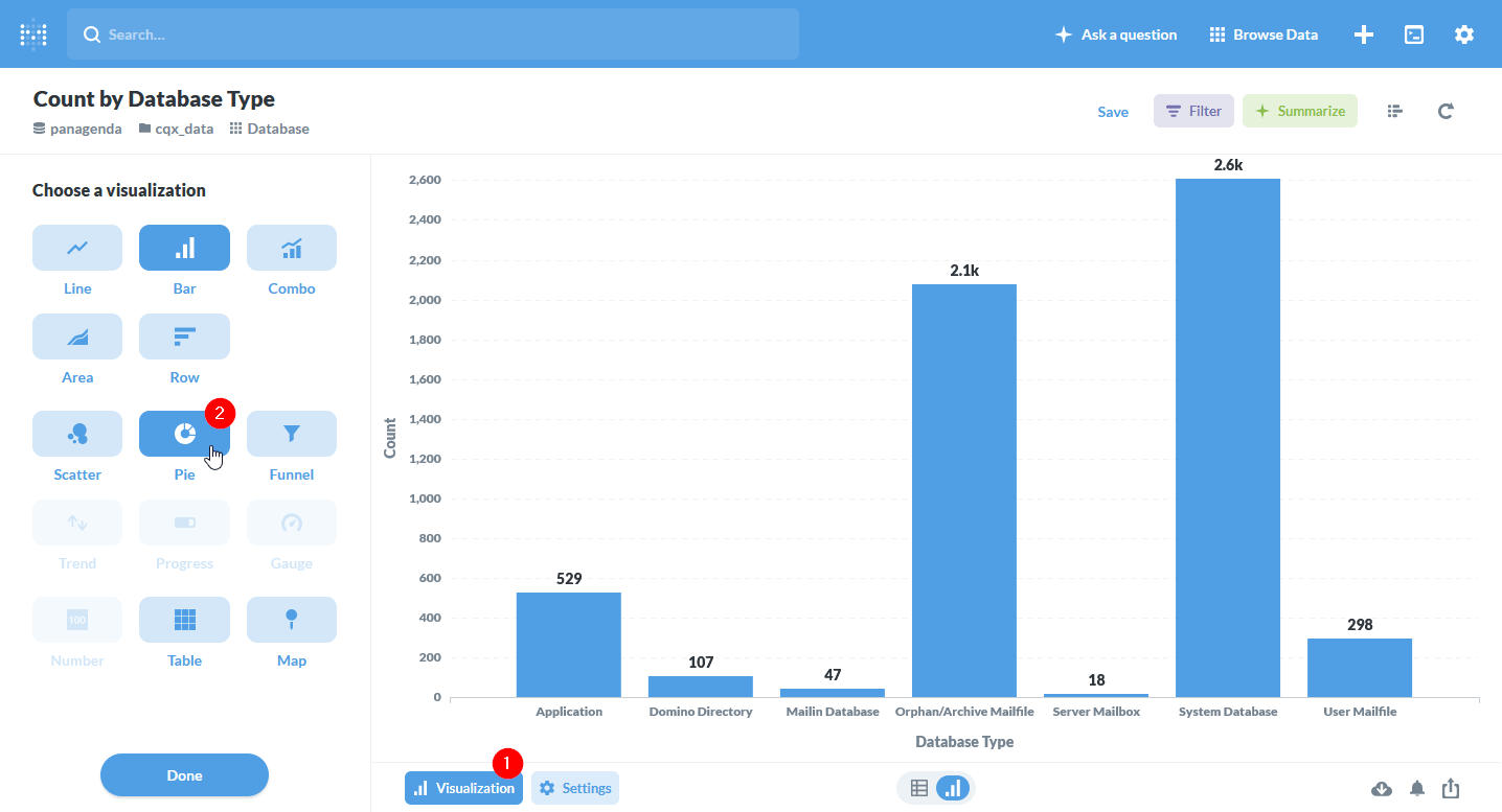
The result we get is a bar chart the number of entries within each database category. Let’s go ahead and change that to a pie chart by clicking “Visualization” (1) at the bottom and then choosing “Pie” (2) as chart type.
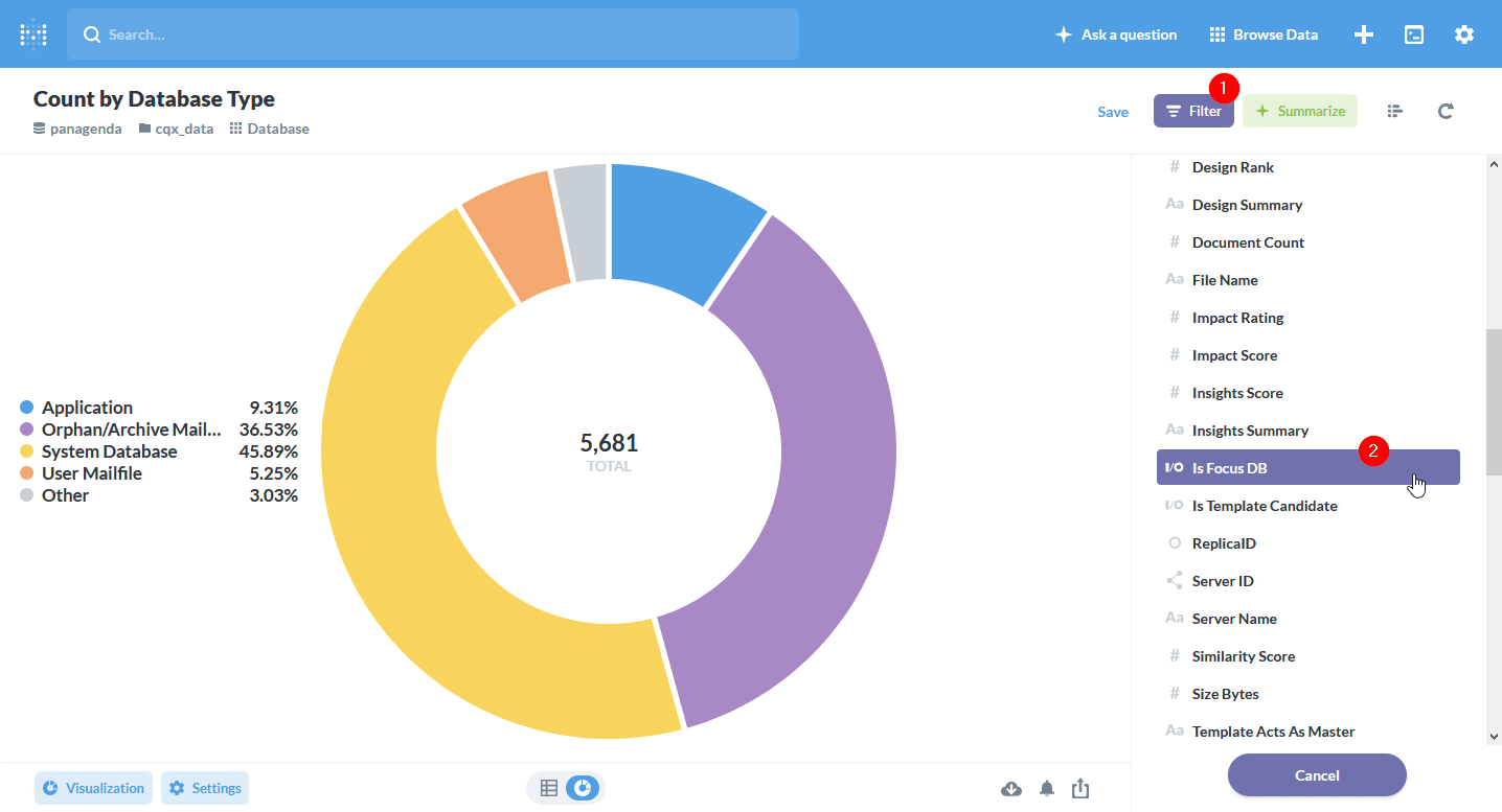
We’re back at the point where we see the distribution of DBs across database categories in a pie chart (or donut in this case). Again we want to display only Focus DBs. We can accomplish that by clicking “Filter” (1) on the top navigation bar and then selecting the “Is Focus DB” (2) in the field list.
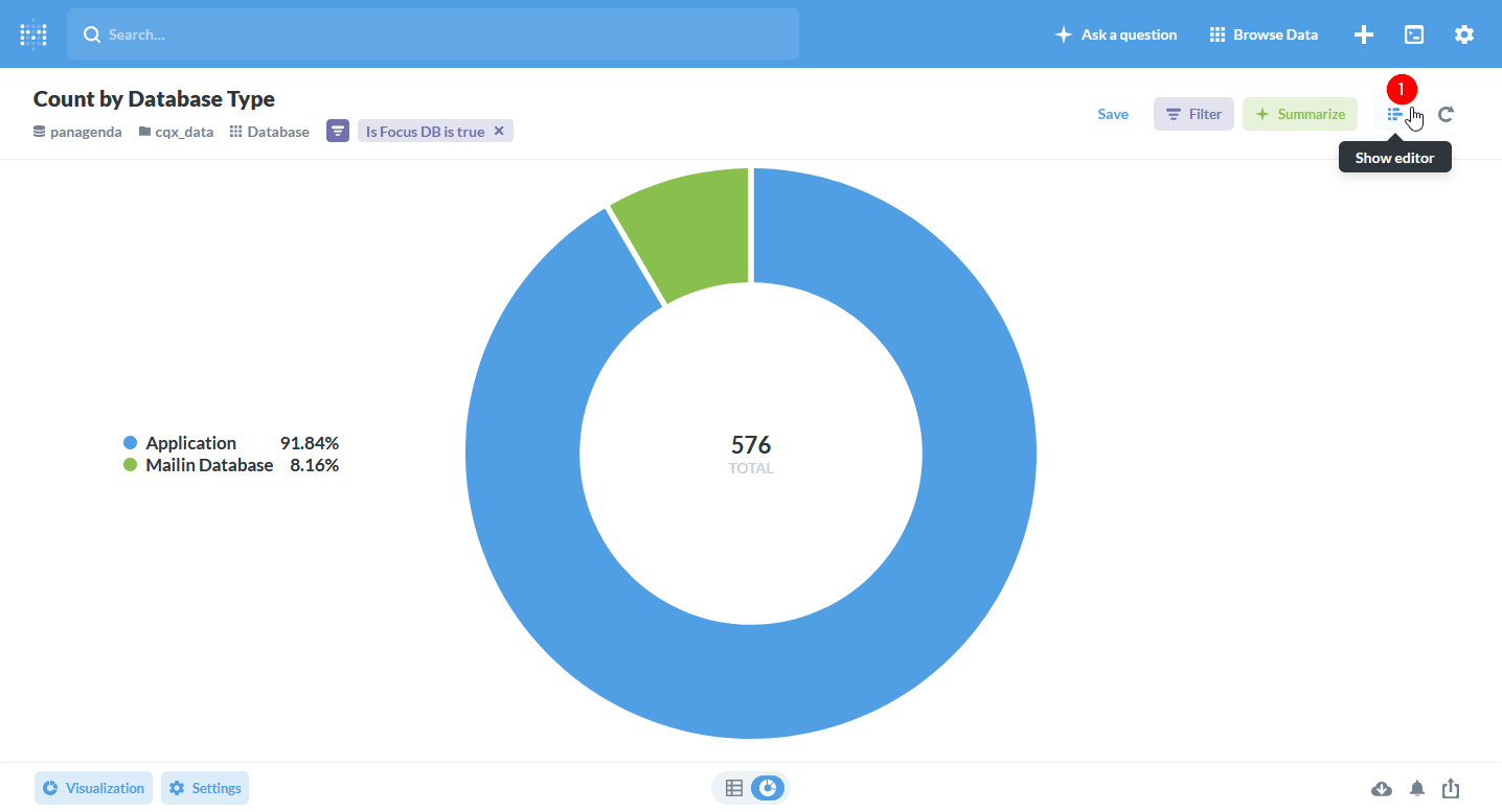
Yay! We have accomplished our goal and see the distribution of DBs between the two database types. From here there’s a couple of things we can do with our question. If we click on “Show Editor” (1) we will be taken to the same editor we would have gotten if we had selected “Custom question” initially.
Here we can continue to refine our question or view the SQL (1) that was generated for us by Metabase. We also have a bunch of advanced techniques we utilize here: joining with other data tables, sorting, limiting or even creating custom columns.
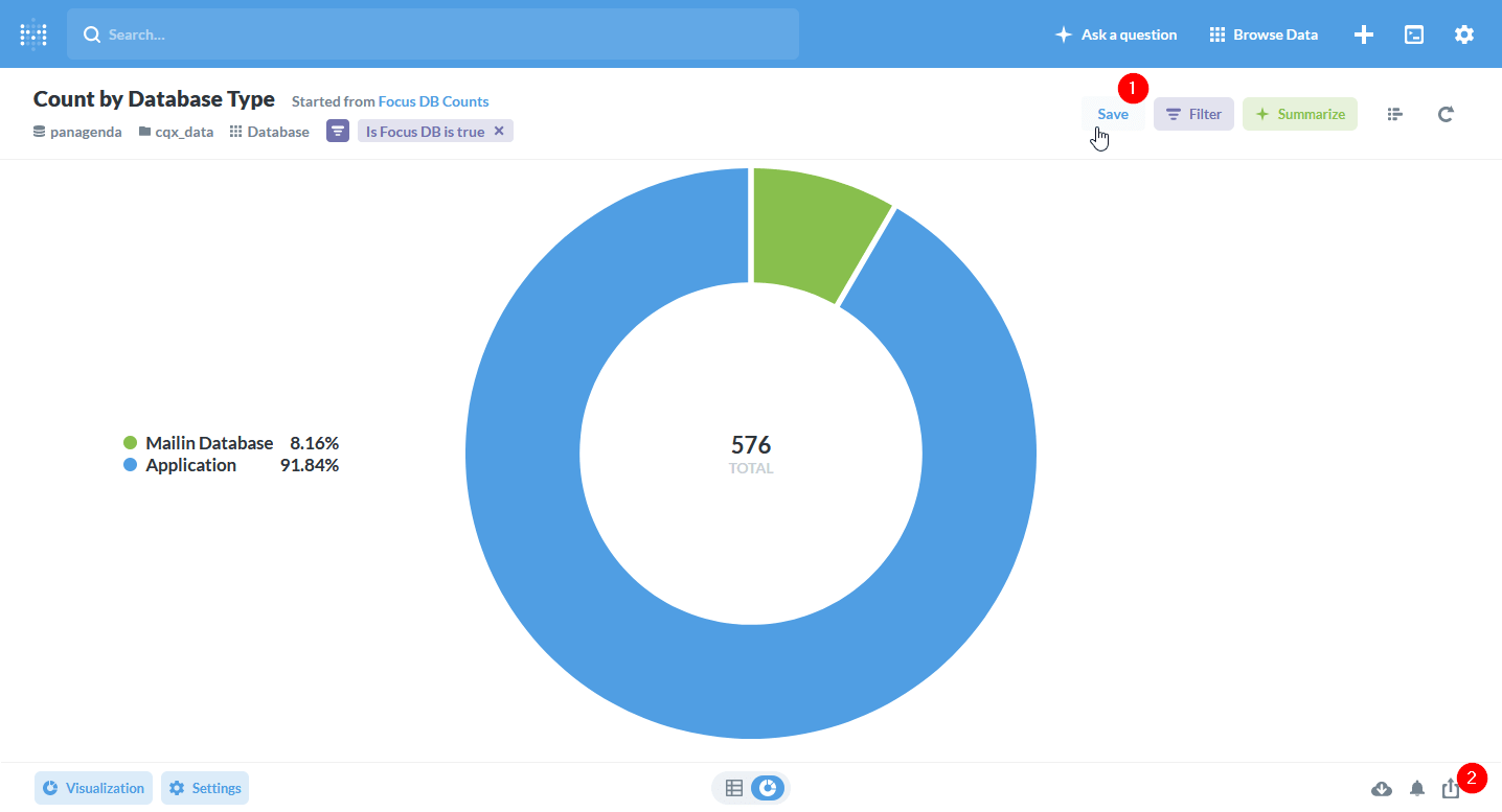
Now how do we share this with our stakeholders? It all starts with saving that question (1) and optionally adding it to a dashboard.
N.B. – We won’t go into dashboarding in this blog post, but if you would like to see more on the topic or advanced Metabase use cases, please let us know in the comments.
Now that we have a saved question, we get an additional option on the bottom row (2) to share and embed our question.
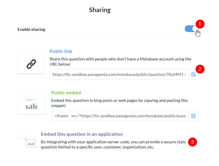
With this dialog, we can share (1) our question or dashboard publicly or embed it in a site where we control access. You can also publish (2) a dashboard of overview data on the intranet without additional access control if employee intranet is limited. More advanced statistics are embedded (3) in an area with advanced access control.
Even though this method of sharing is great, it’s not really needed. You can simply give your co-workers access to the Metabase installation and create custom dashboards for whatever information you want to provide them with.
Make your life easier and more productive
These are just 3 ways you can simplify your life by automating your reporting. There’s so much more you can do with the right tools and a little know-how.
Next in our series
Migration and modernization projects are hugely expensive and very high-profile. From the very start, a lot of eyes will be on you. Expectations will be high. How can you keep your project from failing? Sometimes you can’t. Some projects are doomed before they even start. You should know before you go.
Many companies around the world have been committed to HCL Notes/Domino* for years. They know the many benefits that come from that relationship. Additionally, Notes/Domino lies at the center of their processes and how they work. Despite all this, IT decisions makers around the world are starting to envision a future where Notes/Domino may play a reduced role or no role at all.
From here on out it will be a continuous widening of the circle of applications we are working on. Each step will be more cost intensive, and prudent planning will yield ever greater benefits.
*formerly IBM Notes/Domino